
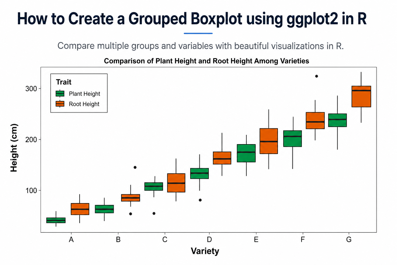
Introduction
Data visualization is one of the most important steps in statistical analysis because it helps researchers understand patterns, variability, and differences among groups. Among various visualization techniques, the boxplot is widely used for displaying the distribution of numerical data.
In biological sciences, agricultural research, environmental studies, and many other scientific disciplines, researchers often need to compare multiple measurements across different groups. For example, plant breeders may want to compare plant height and root height among several varieties. A grouped boxplot provides an effective solution for visualizing such comparisons.
In this tutorial, we will learn how to create a Grouped Boxplot using ggplot2 in R, understand every part of the R script, customize the appearance of the plot, and interpret the results. The example used in this article compares Plant Height and Root Height across seven plant varieties.
What is a Boxplot?
A boxplot (Box-and-Whisker Plot) is a graphical representation of numerical data that summarizes:
- Minimum value
- First Quartile (Q1)
- Median (Q2)
- Third Quartile (Q3)
- Maximum value
- Outliers
A boxplot provides a quick overview of:
- Data distribution
- Central tendency
- Variability
- Presence of outliers
What is a Grouped Boxplot?
A grouped boxplot displays multiple boxplots side-by-side within each category.
Example
Suppose we have:
- Plant Height
- Root Height
measured for:
- Variety A
- Variety B
- Variety C
- Variety D
- Variety E
- Variety F
- Variety G
Instead of creating separate figures, grouped boxplots allow both traits to be displayed together for each variety.
Benefits
- Easy comparison among groups
- Visual identification of trends
- Detection of variability
- Identification of outliers
- Publication-quality presentation
Dataset Structure
The dataset used in this example contains three columns:
| Variety | Trait | Height |
|---|---|---|
| A | Plant Height | 50 |
| A | Root Height | 65 |
| B | Plant Height | 75 |
| B | Root Height | 90 |
Variable Description
| Variable | Description |
|---|---|
| Variety | Plant variety |
| Trait | Plant Height or Root Height |
| Height | Measured height (cm) |
📥 Download Sample Dataset
Step 1: Load Required Package
library(ggplot2)
Explanation
The ggplot2 package is one of the most powerful visualization libraries in R.
It provides:
- Flexible plotting system
- Publication-quality graphics
- Easy customization
- Advanced visualization options
Step 2: Import the Data
plant_data <- read.delim("C:/Users/MOHAN/Desktop/plant_data.txt")
View(plant_data)
Explanation
The read.delim() function imports tab-delimited text files.
The View() function opens the dataset in RStudio for inspection.
Step 3: Check the Dataset
data <- plant_data
head(data)
Explanation
The head() function displays the first six observations.
Example output:
| Variety | Trait | Height |
|---|---|---|
| A | Plant Height | 55 |
| A | Root Height | 70 |
| B | Plant Height | 75 |
| B | Root Height | 95 |
This step helps verify that the data has been imported correctly.
Step 4: Convert Variables into Factors
data$Variety <- factor(
  data$Variety,
  levels = c("A","B","C","D","E","F","G")
)
Why Use Factors?
Factors control:
- Category ordering
- Plot appearance
- Consistent group arrangement
Without factors, R may arrange categories alphabetically.
Trait Factor
data$Trait <- factor(
  data$Trait,
  levels = c("Plant Height","Root Height")
)
This ensures that:
- Plant Height appears first
- Root Height appears second
in every variety.
Step 5: Create the Grouped Boxplot
p <- ggplot(
  data,
  aes(
    x = Variety,
    y = Height,
    fill = Trait
  )
)
Explanation
This defines:
| Aesthetic | Purpose |
|---|---|
| x | Variety |
| y | Height |
| fill | Trait |
The fill argument creates separate colored boxplots for each trait.
Step 6: Add Boxplots
geom_boxplot(
  width = 0.95,
  position = position_dodge(1),
  linewidth = 0.8
)
Explanation
width
Controls box width.
width = 0.95
Produces wider boxes.
position_dodge()
position = position_dodge(1)
Places Plant Height and Root Height side-by-side.
linewidth
linewidth = 0.8
Controls border thickness.
Step 7: Apply Custom Colors
scale_fill_manual(
  values = c(
    "Plant Height" = "#00A651",
    "Root Height"  = "#D55E00"
  ),
  name = "Trait"
)
Explanation
Custom colors improve readability.
| Trait | Color |
|---|---|
| Plant Height | Green |
| Root Height | Orange |
The legend title becomes:
Trait
Step 8: Add Labels
labs(
  title = "Comparison of Plant Height and Root Height Among Varieties",
  x = "Variety",
  y = "Height (cm)"
)
Explanation
This adds:
- Plot title
- X-axis label
- Y-axis label
making the figure easier to understand.
Step 9: Apply Theme
theme_bw(base_size = 15)
Explanation
The black-and-white theme creates a clean scientific appearance suitable for:
- Journal articles
- Theses
- Reports
- Conference presentations
Step 10: Customize Plot Appearance
theme(
  legend.position = c(0.15, 0.85)
)
Places the legend inside the plot.
Legend Background
legend.background = element_rect(
 fill = "white",
 colour = "black"
)
Creates a bordered legend box.
Legend Title
legend.title = element_text(
 face = "bold",
 size = 12
)
Makes the legend title bold.
Plot Title
plot.title = element_text(
 hjust = 0.5,
 face = "bold",
 size = 16
)
Centers the title.
Axis Titles
axis.title = element_text(
 face = "bold",
 size = 15
)
Improves readability.
Axis Labels
axis.text = element_text(
 colour = "black",
 size = 12
)
Makes labels clearer.
Remove Grid Lines
panel.grid = element_blank()
Creates a cleaner publication-quality figure.
Final Plot
The script generates a grouped boxplot comparing:
- Plant Height
- Root Height
across:
- Variety A
- Variety B
- Variety C
- Variety D
- Variety E
- Variety F
- Variety G
using customized colors and professional formatting. The script is provided in the uploaded file.
Interpretation of the Grouped Boxplot
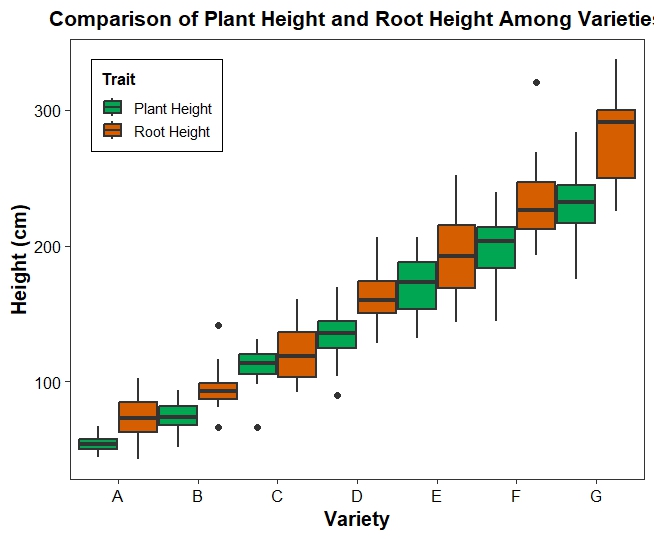
Variety A
- Lowest heights among all varieties.
- Root Height median is slightly higher than Plant Height.
- Low variability
Variety B
- Moderate increase in both traits.
- Root Height remains higher than Plant Height.
- One outlier is visible.
Variety C
- Noticeable increase in growth.
- Wider spread indicates higher variability.
Variety D
- Both traits continue increasing.
- Median values are clearly higher than previous varieties.
Variety E
- Strong growth performance.
- Greater variation among observations.
Variety F
- High median heights.
- Root Height exceeds Plant Height.
- Presence of a high outlier around 320 cm.
Variety G
- Highest overall heights.
- Largest median values.
- Wider interquartile range indicating variability.
Overall Biological Interpretation
The plot suggests:
- Growth increases progressively from Variety A to Variety G.
- Root Height tends to be higher than Plant Height in most varieties.
- Variety G exhibits the greatest growth potential.
- Some varieties show higher variability, indicating environmental or genetic effects.
- Outliers may represent exceptionally performing plants.
YouTube Video
Advantages of Grouped Boxplots
Grouped boxplots help researchers:
- Compare multiple traits simultaneously
- Visualize variation within groups
- Detect outliers
- Examine distribution patterns
- Present publication-quality results
They are widely used in:
- Plant breeding
- Agriculture
- Ecology
- Biostatistics
- Medical research
- Environmental sciences
📥 Download Complete R Script
Conclusion
Grouped boxplots are powerful tools for comparing multiple groups and traits in a single visualization. Using ggplot2, researchers can easily create publication-quality grouped boxplots with customized colors, themes, labels, and legends. In this example, we compared Plant Height and Root Height across seven plant varieties and observed a clear increasing trend from Variety A to Variety G. By mastering grouped boxplots in R, researchers can effectively explore data distributions, identify variability, detect outliers, and communicate scientific findings more clearly.