
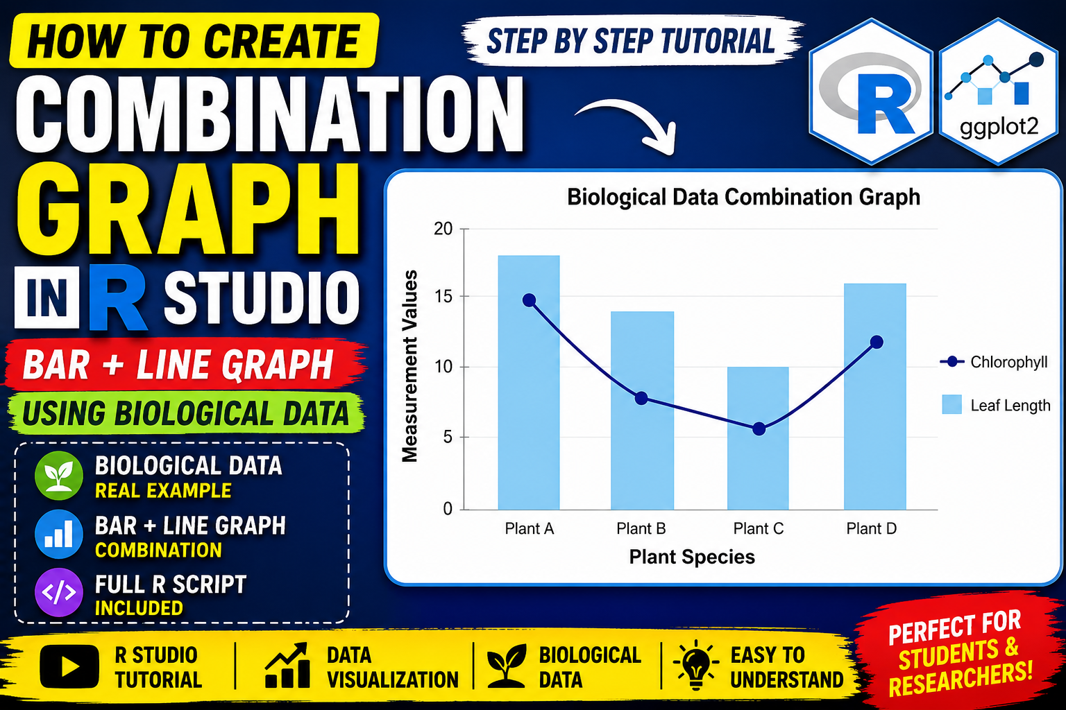
Introduction
Data visualization is one of the most important techniques in biostatistics, bioinformatics, ecology, and biological research. Researchers often work with multiple biological variables that need to be compared simultaneously. In such cases, a simple graph may not clearly represent the relationship between variables. A Combination Graph helps solve this problem by displaying two types of graphical representations together in a single chart.
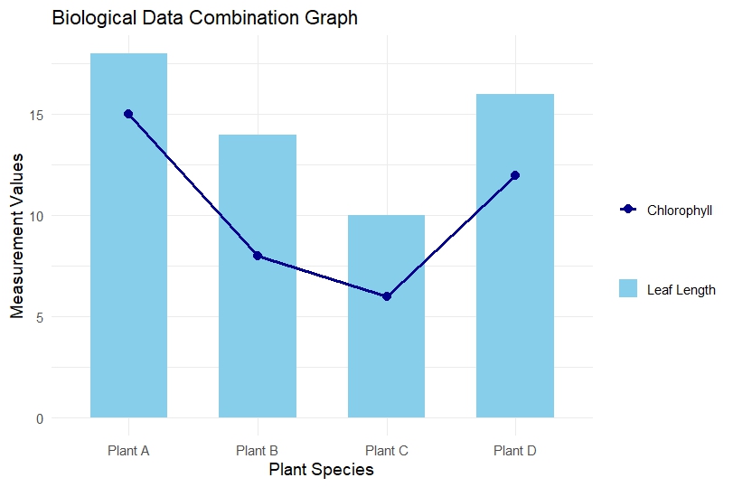
A Combination Graph combines a Bar Graph and a Line Graph to visualize two different datasets simultaneously. In biological studies, this type of graph is useful for comparing plant growth, chlorophyll content, enzyme activity, species population, biomass production, and many other biological parameters.
In this tutorial, you will learn how to create a Combination Graph in R Studio using biological data with the ggplot2 package. This article explains the concept, dataset creation, complete R script, graph interpretation, and common error solutions step by step.
The graph used in this tutorial is based on biological data comparing leaf length and chlorophyll content among different plant species.
Watch Video Tutoria
What is a Combination Graph?
A Combination Graph is a data visualization method that combines:
- Bar Graph
- Line Graph
into a single chart.
The bar graph generally represents one biological variable, while the line graph represents another related variable.
For example:
| Plant Species | Leaf Length | Chlorophyll |
|---|---|---|
| Plant A | 18 | 15 |
| Plant B | 14 | 8 |
| Plant C | 10 | 6 |
| Plant D | 16 | 12 |
Here:
- Bar Graph → Leaf Length
- Line Graph → Chlorophyll Content
This graph helps compare two biological measurements simultaneously.
Applications of Combination Graph in Biology
Combination graphs are widely used in:
- Plant Biology
- Ecology
- Agriculture
- Environmental Science
- Microbiology
- Genetics
- Biostatistics
Examples
- Plant height vs chlorophyll content
- Species abundance vs temperature
- Enzyme activity vs pH
- Biomass vs nutrient concentration
- Population density vs rainfall
Software Required
Before starting, install the following software:
1. R Software
Download from:
R Project Official Website
2. R Studio
Download from:
RStudio Official Website
Required Package
We use the ggplot2 package for creating professional graphs.
Install package:
install.packages("ggplot2")
Load package:
library(ggplot2)
Biological Dataset Used in This Tutorial
The following biological dataset is used in this example:
| Species | Leaf Length | Chlorophyll |
|---|---|---|
| Plant A | 18 | 15 |
| Plant B | 14 | 8 |
| Plant C | 10 | 6 |
| Plant D | 16 | 12 |
Variable Explanation
Species
Represents different plant species.
Leaf Length
Represents average leaf length measurement.
Chlorophyll
Represents chlorophyll content of each species.
Step-by-Step Explanation to Create Combination Graph in R Studio
Step 1: Install ggplot2 Package
Run the following command only once:
install.packages("ggplot2")
This command downloads and installs the package from CRAN.
Step 2: Load ggplot2 Library
library(ggplot2)
This loads the package into the R environment.
Step 3: Create Biological Dataset
biology_data <- data.frame(
  Species = c("Plant A", "Plant B", "Plant C", "Plant D"),
  Leaf_Length = c(18, 14, 10, 16),
  Chlorophyll = c(15, 8, 6, 12)
)
Explanation
data.frame()
Creates a tabular dataset.
Species
Stores plant names.
Leaf_Length
Stores leaf length values.
Chlorophyll
Stores chlorophyll measureme
Step 4: View Dataset
print(biology_data)
This displays the dataset in the R console.
Step 5: Create Combination Graph
Complete script
ggplot(biology_data, aes(x = Species)) +

  geom_bar(aes(y = Leaf_Length, fill = "Leaf Length"),
           stat = "identity",
           width = 0.6) +

  geom_line(aes(y = Chlorophyll,
                color = "Chlorophyll",
                group = 1),
            linewidth = 1.2) +

  geom_point(aes(y = Chlorophyll,
                 color = "Chlorophyll"),
             size = 3) +

  labs(
    title = "Biological Data Combination Graph",
    x = "Plant Species",
    y = "Measurement Values",
    fill = "",
    color = ""
  ) +

  scale_fill_manual(values = c("Leaf Length" = "skyblue")) +

  scale_color_manual(values = c("Chlorophyll" = "darkblue")) +

  theme_minimal(base_size = 14)
Detailed Explanation of Graph Components
ggplot()
ggplot(biology_data, aes(x = Species))
Initializes the graph using the dataset.
geom_bar()
geom_bar(aes(y = Leaf_Length, fill = "Leaf Length"),
         stat = "identity")
Creates the bar graph.
Important Arguments
y = Leaf_Length
Defines bar height.
fill
Adds color legend.
stat = “identity”
Uses actual dataset values.
geom_line()
geom_line(aes(y = Chlorophyll,
              color = "Chlorophyll",
              group = 1))
Creates the line graph.
group = 1
Connects all points using a single line.
geom_point()
geom_point(aes(y = Chlorophyll,
               color = "Chlorophyll"))
Adds points on the line graph.
labs()
Adds graph title and axis labels.
scale_fill_manual()
Defines bar color.
scale_color_manual()
Defines line color.
theme_minimal()
Applies clean professional styling.
Graph Interpretation
The generated graph shows two biological variables together:
- Leaf Length (Bar Graph)
- Chlorophyll Content (Line Graph)
Interpretation
Plant A
Shows the highest leaf length and chlorophyll content.
Plant B
Displays moderate leaf length but lower chlorophyll.
Plant C
Shows the lowest values for both variables.
Plant D
Shows increased chlorophyll and moderate leaf length.
The graph indicates a possible positive relationship between leaf length and chlorophyll content.
Common Errors and Solutions
Error 1: Unexpected Symbol
Cause
Missing comma after aes().
Wrong
geom_bar(aes(y = Leaf_Length)
stat = "identity")
Correct
geom_bar(aes(y = Leaf_Length),
         stat = "identity")
Error 2: Object Not Found
Cause
Column name mismatch.
Example
leaf_length
instead of:
Leaf_Length
R is case-sensitive.
Error 3: Scale for Fill Already Present
Cause
Using scale_fill_manual() twice.
Solution
Use:
scale_fill_manual()
for bars and
scale_color_manual()
for lines.
Advantages of Combination Graph
- Visualizes two variables simultaneously
- Easy biological comparison
- Professional scientific visualization
- Publication-quality graphs
- Better interpretation of relationships
Download File
Download Full R Script File
Conclusion
Combination Graphs are highly effective for visualizing multiple biological variables simultaneously. In this tutorial, we learned how to create a Combination Graph in R Studio using the ggplot2 package and biological data.
The graph successfully compared leaf length and chlorophyll content among different plant species using both bar and line representations. This type of visualization is extremely useful in biostatistics, ecology, plant biology, and environmental research.
By following this step-by-step guide, beginners and researchers can easily create publication-quality biological graphs in R Studio for research papers, reports, and presentations.