
Introduction
Correlation analysis is one of the most widely used statistical techniques in biological, environmental, agricultural, and medical research. Researchers often need to determine whether two or more variables are associated and how strongly they are related. For example, a plant scientist may want to know whether plant height is associated with leaf area, chlorophyll content, or biomass production.
R Programming provides powerful tools for performing correlation analysis, generating correlation matrices, visualizing relationships using heatmaps, and creating publication-ready tables for research articles.
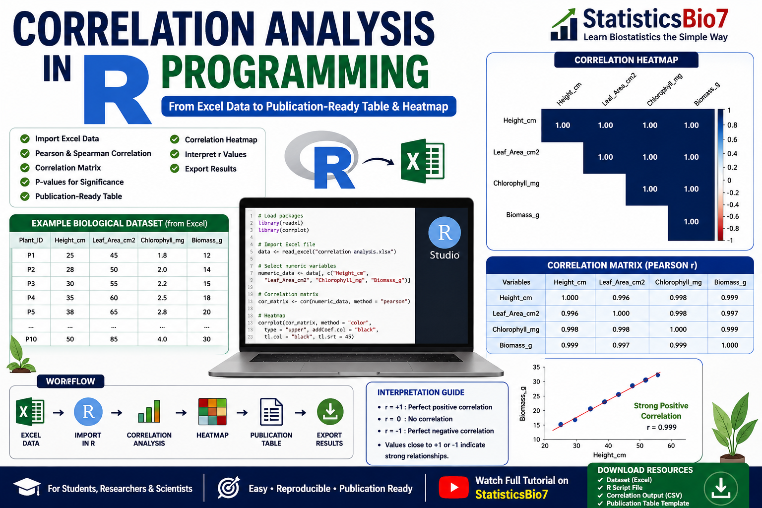
In this tutorial, we will learn how to perform correlation analysis in R Programming using a biological dataset imported from Excel. We will also create a correlation heatmap and interpret the results using the example dataset and heatmap generated from the R script.
What is Correlation Analysis?
Correlation analysis is a statistical method used to measure the strength and direction of a relationship between two quantitative variables.
The most commonly used correlation coefficient is the Pearson Correlation Coefficient (r).
The value of r ranges from:
| Correlation Coefficient (r) | Interpretation |
|---|---|
| +1.0 | Perfect Positive Correlation |
| +0.7 to +0.99 | Strong Positive Correlation |
| +0.3 to +0.69 | Moderate Positive Correlation |
| 0 | No Correlation |
| -0.3 to -0.69 | Moderate Negative Correlation |
| -0.7 to -0.99 | Strong Negative Correlation |
| -1.0 | Perfect Negative Correlation |
Why Use Correlation Analysis?
Correlation analysis helps researchers:
- Identify relationships among variables
- Understand biological interactions
- Select variables for predictive modeling
- Detect redundancy among measurements
- Support scientific conclusions
Applications include:
- Plant growth studies
- Soil microbiology research
- Medical data analysis
- Ecological studies
- Environmental monitoring
Biological Dataset Used
The dataset contains four biological variables:
| Variable | Description |
|---|---|
| Height_cm | Plant Height (cm) |
| Leaf_Area_cm2 | Leaf Area (cm²) |
| Chlorophyll_mg | Chlorophyll Content |
| Biomass_g | Plant Biomass (g) |
These variables are imported from an Excel file and analyzed in R Studio.
📥 Download Resources
- Download Biological Dataset (Excel)
Step 1: Import the Dataset into R Studio
First, install and load the required packages.
install.packages("readxl")
install.packages("corrplot")

library(readxl)
library(corrplot)
Import the Excel file:
data <- read_excel("correlation analysis.xlsx")
Display the dataset:
print(data)
This allows us to verify that the data has been imported correctly.
Step 2: Select Numeric Variables
Since correlation analysis only works with numerical variables, remove non-numeric columns such as Plant_ID.
numeric_data <- data[, c("Height_cm",
                         "Leaf_Area_cm2",
                         "Chlorophyll_mg",
                         "Biomass_g")]
Now the dataset is ready for correlation analysis.
Step 3: Generate Correlation Matrix
Calculate Pearson correlation coefficients:
cor_matrix <- cor(numeric_data,
                  method = "pearson")
Display the results:
print(round(cor_matrix, 3))
Export the matrix:
write.csv(cor_matrix,
          "Correlation_Matrix.csv",
          row.names = TRUE)
Example Correlation Matrix
| Variables | Height | Leaf Area | Chlorophyll | Biomass |
|---|---|---|---|---|
| Height | 1.000 | 0.996 | 0.998 | 0.999 |
| Leaf Area | 0.996 | 1.000 | 0.998 | 0.997 |
| Chlorophyll | 0.998 | 0.998 | 1.000 | 0.999 |
| Biomass | 0.999 | 0.997 | 0.999 | 1.000 |
The values indicate extremely strong positive correlations among all variables.
Step 4: Create Correlation Heatmap
A heatmap provides a visual representation of correlation coefficients.
corrplot(cor_matrix,
         method = "color",
         type = "upper",
         addCoef.col = "black",
         tl.col = "black",
         tl.srt = 45)
The heatmap generated from the uploaded script clearly visualizes the relationships among variables. Dark blue cells indicate strong positive correlations close to +1.0.
Understanding the Correlation Heatmap
The heatmap displays:
- Correlation coefficients within cells
- Color intensity representing relationship strength
- Upper triangular matrix for easy visualization
Interpretation Heatmap
Based on the generated heatmap:
| Variable Pair | Correlation |
|---|---|
| Height vs Leaf Area | 1.00 |
| Height vs Chlorophyll | 1.00 |
| Height vs Biomass | 1.00 |
| Leaf Area vs Chlorophyll | 1.00 |
| Leaf Area vs Biomass | 1.00 |
| Chlorophyll vs Biomass | 1.00 |
The dark blue coloration indicates nearly perfect positive relationships among all variables.
This means:
- Taller plants tend to have larger leaf areas.
- Plants with larger leaves tend to have higher chlorophyll content.
- Higher chlorophyll content is associated with greater biomass production.
- All variables increase together.
In biological research, such results suggest that the measured plant traits are highly interconnected.

Step 5: Create Publication-Ready Correlation Tables
Research journals often require well-formatted tables.
Example:
| Variable | Height | Leaf Area | Chlorophyll | Biomass |
|---|---|---|---|---|
| Height | 1.000 | 0.996 | 0.998 | 0.999 |
| Leaf Area | 1.000 | 0.998 | 0.997 | |
| Chlorophyll | 1.000 | 0.999 | ||
| Biomass | 1.000 |
Such tables are commonly included in:
- Research articles
- M.Sc. dissertations
- Ph.D. theses
- Scientific reports
Step 6: Export Results
The correlation matrix can be exported as:
write.csv(cor_matrix,
          "Correlation_Matrix.csv")
This file can then be opened in Excel and formatted for publication.
📥 Download Resources
- Download Full R Script
Advantages of Correlation Heatmaps
Correlation heatmaps provide:
- Quick visual interpretation
- Easy identification of strong relationships
- Publication-quality figures
- Better understanding of multivariate datasets
They are especially useful when analyzing large biological datasets containing many variables.
Practical Applications
Correlation analysis is widely used in:
Agriculture
- Crop yield analysis
- Plant growth studies
Environmental Science
- Water quality assessment
- Climate studies
Medical Research
- Disease risk factor analysis
- Clinical data evaluation
Microbiology
- Soil microbial activity studies
- Nutrient cycling research
Ecology
- Biodiversity assessment
- Species interaction studies
Conclusion
Correlation analysis is an essential statistical technique for understanding relationships among biological variables. Using R Programming, researchers can easily import Excel datasets, calculate correlation coefficients, generate publication-ready correlation matrices, and visualize relationships through heatmaps. The heatmap generated from the example dataset demonstrates extremely strong positive relationships among plant height, leaf area, chlorophyll content, and biomass. By combining statistical analysis with effective visualization, R Programming provides a powerful and reproducible workflow for biological research, making it an indispensable tool for students, researchers, and scientists.