
Introduction
Data visualization is one of the most important parts of biological research and biostatistics. Researchers often need to compare multiple variables across different categories to understand patterns, trends, and relationships in biological datasets. One of the best visualization methods for this purpose is the Multi Bar Graph.
A multi bar graph helps compare several groups of data side by side in a single chart. In biology and biostatistics, this graph is commonly used for comparing gene expression levels, enzyme activities, treatment effects, tissue responses, and many other experimental results.
In this tutorial, you will learn how to create a professional multi bar graph in R Studio using the ggplot2 package. This article explains everything step by step using a biological dataset example.
Video Tutorial
Watch the complete step-by-step tutorial below
What is a Multi Bar Graph?
A Multi Bar Graph, also called a Grouped Bar Chart, is a graphical representation where multiple bars are displayed together for each category.
It is mainly used to:
- Compare multiple groups
- Visualize biological datasets
- Show differences between variables
- Analyze experimental data
In this example, we compare:
- Different tissues
- Multiple genes
- Gene expression levels
Why Use Multi Bar Graphs in Biology?
Multi bar graphs are highly useful in biological and medical research because they:
- Simplify complex datasets
- Help identify trends quickly
- Improve interpretation of experimental data
- Enhance research presentation quality
Examples include:
- Gene expression analysis
- Drug treatment comparison
- Protein concentration studies
- Enzyme activity measurements
Biological Dataset Used in This Tutorial
The dataset contains:
- Tissue names
- Gene names
- Expression levels
Example Dataset
| Tissue | Gene | Expression |
|---|---|---|
| Liver | Gene_A | 1.0 |
| Heart | Gene_A | 1.2 |
| Brain | Gene_A | 2.3 |
| Kidney | Gene_A | 1.2 |
This dataset is already arranged in long format, which is suitable for ggplot2.
Software Requirements
Before starting, install:
- R
- R Studio
- ggplot2 package
Step-by-Step Explanation of R Script
Step 1: Install ggplot2 Package
install.packages("ggplot2")
Explanation
This command installs the ggplot2 package into R.
Why ggplot2?
ggplot2 is one of the most powerful and popular data visualization packages in R programming.
It helps create:
- Bar graphs
- Scatter plots
- Histograms
- Heatmaps
- Line charts
- Boxplots
You only need to install the package once.
Step 2: Load the Package
library(ggplot2)
Explanation
This command loads the ggplot2 package into the R environment so its functions can be used.
Step 3: Create the Biological Dataset
data <- data.frame(
  Tissue = rep(c("Liver", "Heart", "Brain", "Kidney"), 3),

  Gene = rep(c("Gene_A", "Gene_B", "Gene_C"),
             each = 4),

  Expression = c(
    1.0, 1.2, 2.3, 1.2,
    1.5, 1.4, 1.0, 3.2,
    4.0, 3.0, 2.0, 1.0
  )
)
Explanation
This section creates a biological dataset manually.
Tissue Column
Tissue = rep(c("Liver", "Heart", "Brain", "Kidney"), 3)
The rep() function repeats tissue names three times.
Gene Column
Gene = rep(c("Gene_A", "Gene_B", "Gene_C"),
             each = 4)
This repeats each gene name four times.
Expression Column
Contains numerical gene expression values.
Step 4: View the Dataset
print(data)
Explanation
Displays the dataset in the R console.
This helps verify:
- Correct data structure
- Variable names
- Numerical values
Step 5: Create the Multi Bar Graph
ggplot(data,
       aes(x = Tissue,
           y = Expression,
           fill = Gene)) +

  geom_bar(stat = "identity",
           position = "dodge") +

  labs(
    title = "Multi Bar Graph",
    x = "Tissue",
    y = "Expression Level"
  ) +

  theme_minimal()
Explanation of Each Component
ggplot()
ggplot(data,
       aes(x = Tissue,
           y = Expression,
           fill = Gene))
Purpose
Defines:
- Dataset
- X-axis
- Y-axis
- Bar colors
Mapping
| Parameter | Meaning |
|---|---|
| x = Tissue | Tissue categories |
| y = Expression | Numerical values |
| fill = Gene | Different colors for genes |
geom_bar()
geom_bar(stat = "identity",
         position = "dodge")
stat = “identity”
Uses actual dataset values.
position = “dodge”
Places bars side by side instead of stacking them.
This creates the multi bar graph appearance.
labs()
labs(
  title = "Multi Bar Graph",
  x = "Tissue",
  y = "Expression Level"
)
Purpose
Adds:
- Graph title
- X-axis label
- Y-axis label
theme_minimal()
theme_minimal()
Purpose
Applies a clean professional theme to the graph.
Understanding the Output Graph
The graph compares gene expression levels across different tissues.
X-Axis
Represents tissues:
- Brain
- Heart
- Kidney
- Liver
Y-Axis
Represents expression levels.
Colors
Different colors represent different genes:
- Gene_A
- Gene_B
- Gene_C
Interpretation of the Graph
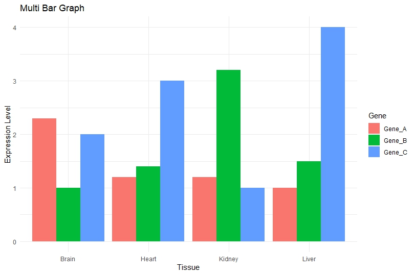
Key Observations
Brain
- Gene_A shows highest expression.
- Gene_B has lower expression.
- Gene_C shows moderate expression.
Heart
- Gene_C expression is highest.
- Gene_A and Gene_B are comparatively lower.
Kidney
- Gene_B shows maximum expression.
- Gene_C has lowest expression.
Liver
- Gene_C shows highest overall expression.
- Gene_A remains lowest.
Advantages of Multi Bar Graphs
Easy Comparison
Helps compare multiple biological variables simultaneously.
Clear Visualization
Makes experimental results easy to interpret.
Publication Quality
Suitable for:
- Research papers
- Thesis work
- Presentations
- Scientific reports
Common Applications in Biostatistics
Multi bar graphs are widely used in:
- Gene expression studies
- Clinical research
- Microbiology
- Molecular biology
- Pharmacology
- Biotechnology
Download Full R Script File
Conclusion
Creating a Multi Bar Graph in R Studio is an excellent way to visualize biological datasets effectively. Using the ggplot2 package, researchers and students can create professional-quality grouped bar charts with minimal code.
In this tutorial, we learned:
- What a multi bar graph is
- Why it is important in biology
- How to create biological datasets
- How to build grouped bar charts step by step
- How to interpret the graph output
The provided R script offers a beginner-friendly approach for creating publication-quality biological visualizations in R Studio. By mastering grouped bar charts, researchers can better communicate experimental findings and improve data analysis workflows.