
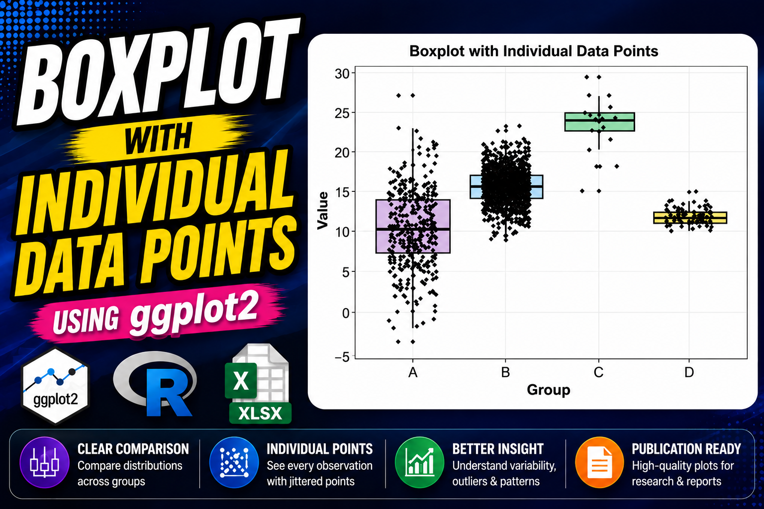
Introduction
Data visualization is a crucial component of statistical analysis and scientific research. When working with biological, biomedical, environmental, or clinical datasets, researchers often need to compare distributions among different groups. Although boxplots provide an excellent summary of data distributions, they sometimes hide the underlying observations. To overcome this limitation, individual data points can be added to the boxplot using a jitter technique.
In this tutorial, we will learn how to create a Boxplot with Individual Data Points in R using the ggplot2 package. We will use an Excel dataset, import it into R, perform basic data exploration, create a publication-quality visualization, and interpret the results.
The R script used in this tutorial imports an Excel dataset, converts grouping variables into factors, calculates summary statistics, and generates a professional-quality boxplot with individual observations displayed as jittered points.
What is a Boxplot?
A boxplot, also known as a box-and-whisker plot, is a graphical representation of numerical data through quartiles.
A boxplot displays:
- Minimum value
- First Quartile (Q1)
- Median (Q2)
- Third Quartile (Q3)
- Maximum value
- Potential outliers
Boxplots are widely used because they summarize large datasets efficiently and allow easy comparison between groups.
Advantages of Boxplots
- Easy visualization of data distribution
- Identification of outliers
- Comparison of multiple groups
- Compact representation of large datasets
What are Individual Data Points?
Individual data points represent the actual observations collected during an experiment or study.
Instead of displaying only summary statistics, individual observations are plotted directly on the graph. This provides transparency and allows readers to evaluate:
- Sample size
- Distribution patterns
- Clustering
- Outliers
- Data variability
In ggplot2, individual observations can be added using the geom_jitter() function.
Why Combine Boxplots and Individual Data Points?
Combining these two visualization methods offers the best of both worlds.
The boxplot provides:
- Statistical summary
- Median
- Interquartile range
The individual points provide:
- Raw data visibility
- Sample distribution
- Outlier identification
As a result, many journals now encourage or require the use of boxplots with individual data points.
Dataset Used
The dataset contains two columns:
| Variable | Description |
|---|---|
| Group | Experimental Group (A, B, C, D) |
| Value | Measured Observation |
The dataset contains:
| Group | Sample Size |
|---|---|
| A | 400 |
| B | 1200 |
| C | 20 |
| D | 80 |
Total observations = 1700
Download Resources
📥 Download Dataset (Excel File)
Step 1: Install Required Packages
The first step is installing the required packages.
install.packages("ggplot2")
install.packages("dplyr")
install.packages("readxl")
These packages are used for visualization, data manipulation, and Excel file import.
Step 2: Load Libraries
Next, load the packages into the R session.
library(ggplot2)
library(dplyr)
library(readxl)
These libraries provide the functions required throughout the analysis.
Step 3: Import Excel Dataset
Import the Excel file using the read_excel() function.
data <- read_excel(
"C:/Users/Desktop/Boxplot with Individual Data Points in R/Biological_Dataset.xlsx"
)
This command reads the dataset and stores it in the object named data.
Step 4: Explore the Dataset
Before visualization, it is important to inspect the dataset.
head(data)
str(data)
summary(data)
These functions allow us to:
- View the first few rows
- Check variable types
- Examine descriptive statistics
Step 5: Convert Group Variable into a Factor
Grouping variables should be treated as factors.
data$Group <- factor(
data$Group,
levels = c("A","B","C","D")
)
This ensures that groups appear in the desired order on the plot.
Step 6: Generate Summary Statistics
Descriptive statistics help us understand the dataset before plotting.
summary_stats <- data %>%
group_by(Group) %>%
summarise(
N = n(),
Mean = mean(Value),
SD = sd(Value),
Median = median(Value),
Min = min(Value),
Max = max(Value)
)
This produces:
- Sample size
- Mean
- Standard deviation
- Median
- Minimum value
- Maximum value
for each group.
Step 7: Create the Boxplot
The visualization is generated using ggplot2.
ggplot(data,
aes(x = Group,
y = Value,
fill = Group))
This initializes the plot and maps:
- Group → X-axis
- Value → Y-axis
- Group → Fill color
Step 8: Add the Boxplot Layer
geom_boxplot(
width = 0.75,
alpha = 0.7,
colour = "black"
)
This layer draws the boxplots for each group.
Key parameters:
- width controls box width
- alpha controls transparency
- colour defines border color
Step 9: Add Individual Data Points
geom_jitter(
width = 0.25,
size = 1.5,
alpha = 0.8,
colour = "black"
)
This is the most important component of the graph.
The jitter effect slightly spreads points horizontally, preventing overlap and improving visibility.
Step 10: Customize Colors
The plot uses manually defined colors.
scale_fill_manual(
values = c(
"#B497C7",
"#A6C8E0",
"#8FD0A8",
"#F4E98B"
)
)
Each group receives a distinct color.
Step 11: Add Labels and Theme
labs(
title = "Boxplot with Individual Data Points",
x = "Group",
y = "Value"
)
This adds informative labels to the figure.
The script also applies:
theme_bw()
to create a clean publication-style appearance.
Plot Interpretation
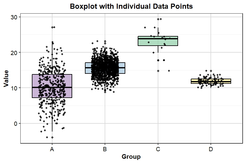
Group A
- Median approximately 10
- Large spread
- Several low and high values
- High variability
Group B
- Median approximately 15–16
- Largest sample size
- Dense concentration of observations
- Moderate variability
Group C
- Highest median value
- Values centered around 23–25
- Small sample size
- Relatively higher measurements
Group D
- Median approximately 12
- Small spread
- Low variability
- More consistent observations
Understanding the Boxplot Components
Median Line
The horizontal line inside the box represents the median.
Interquartile Range (IQR)
The box itself represents the middle 50% of observations.
Whiskers
Whiskers show the range of values excluding extreme outliers.
Individual Points
Black dots represent actual observations collected during the study.
Download Resources
📥 Download Full R Script
YouTube Video
Conclusion
A Boxplot with Individual Data Points is one of the most effective methods for visualizing biological and statistical data. It combines the strengths of boxplots and raw data visualization, allowing researchers to display summary statistics while maintaining transparency regarding individual observations.
Using ggplot2 in R, researchers can easily create publication-quality graphics that clearly communicate group differences, variability, and data distribution. The workflow demonstrated in this tutorial—from importing Excel data to generating high-resolution figures—provides a complete solution for modern scientific data visualization.
Whether you are working in biostatistics, bioinformatics, life sciences, medicine, or environmental sciences, mastering boxplots with individual data points will significantly enhance the quality and interpretability of your research figures.