How to Create a Grouped Boxplot using ggplot2 in R | Compare Multiple Groups with ggplot2

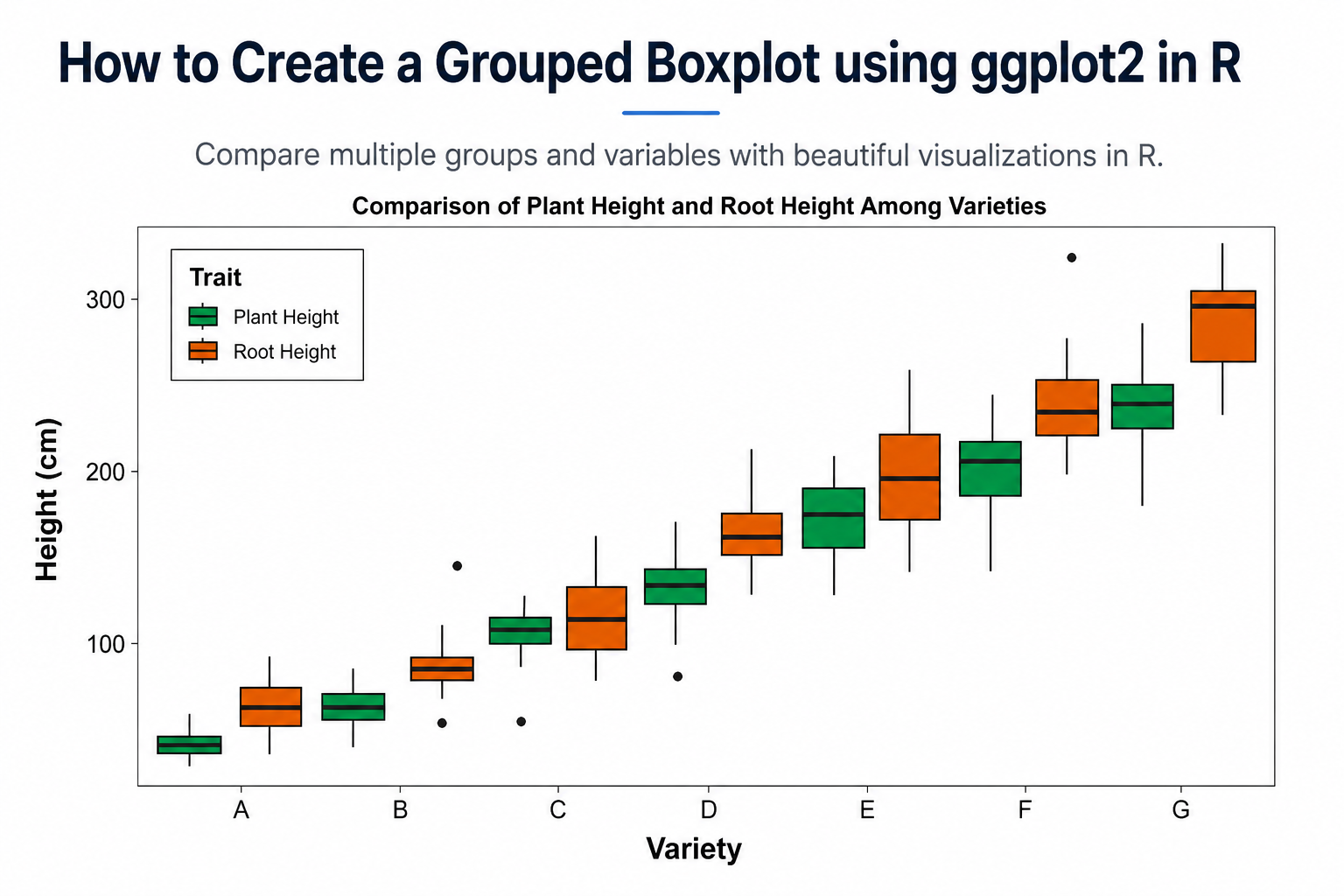
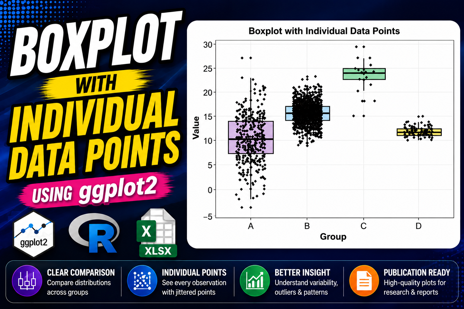
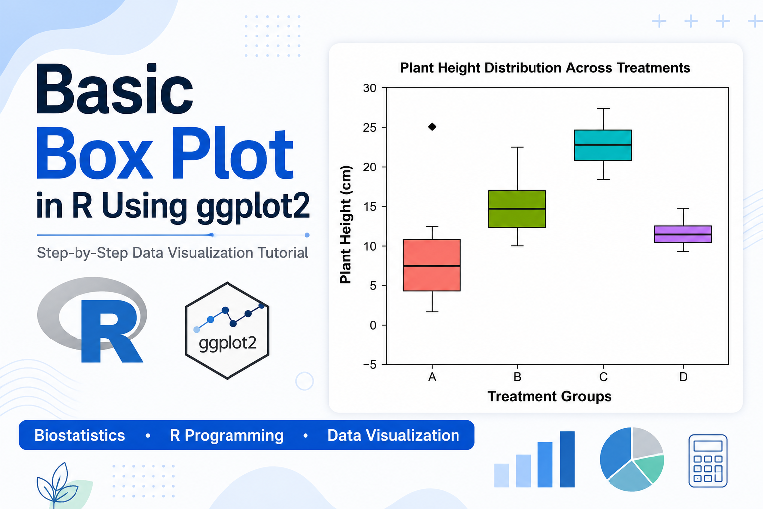
Introduction Data visualization is one of the most important steps in statistical analysis because it helps researchers understand patterns, variability, and differences among groups. Among various visualization techniques, the boxplot is widely used for displaying the distribution of numerical data. In biological sciences, agricultural research, environmental studies, and many other scientific disciplines, researchers often need … Read more

How to Create a Boxplot with Individual Data Points in R Using ggplot2

Introduction Data visualization is a crucial component of statistical analysis and scientific research. When working with biological, biomedical, environmental, or clinical datasets, researchers often need to compare distributions among different groups. Although boxplots provide an excellent summary of data distributions, they sometimes hide the underlying observations. To overcome this limitation, individual data points can be … Read more

How to Create a Basic Box Plot in R Using ggplot2: Step-by-Step Guide with Biological Data

Introduction Data visualization is an essential part of data analysis in biology, biostatistics, bioinformatics, agriculture, and medical research. Before performing advanced statistical analyses, researchers often use graphical techniques to understand the distribution and variability of their data. One of the most effective graphical tools for visualizing data distributions is the box plot, also known as … Read more

How to Create Grouped Bar Chart with Error Bars in R Studio using ggplot2

Introduction Data visualization is an important part of biological research and biostatistics. Scientists and researchers often use graphs to compare experimental results and clearly present their findings. Among the many visualization techniques available in R Studio, the grouped bar chart with error bars is one of the most useful methods for displaying biological data. A … Read more

Create Bar Chart with Standard Deviation in R Using ggplot2

Introduction Data visualization is a crucial part of statistical analysis, especially in fields like biostatistics, agriculture, and data science. Among various visualization techniques, bar charts are widely used to compare categorical data. However, simple bar charts only display averages and fail to show variability in the data. To overcome this limitation, we use standard deviation … Read more

How to Change Bar Colors Individually in R Barplot

Introduction Data visualization is a critical component of data analysis, especially in fields like biostatistics and biomedical research. Among the many visualization tools available in R, the barplot is one of the simplest and most widely used methods for representing categorical data. In real-world scenarios, using a single color for all bars may not effectively … Read more

How to Create a Basic Bar Chart in R Studio

Introduction Data visualization is a crucial component of biostatistics, helping researchers and students interpret complex datasets easily. Among the various graphical tools available, the bar chart is one of the simplest and most effective methods for representing categorical data. In this tutorial, you will learn how to create a basic bar chart in R Studio … Read more

R Programming: How to Use R in Biostatistics – A Complete Beginner to Advanced Guide

R programming in biostatistics for data analysis and statistical modeling

Introduction Biostatistics plays a crucial role in biological sciences, medicine, public health, agriculture, and environmental research. With the growing volume of biological data, traditional statistical tools are no longer sufficient. This is where R programming becomes an essential skill for students, researchers, and scientists. R is a free, open-source statistical programming language widely used in … Read more