
Introduction
Data visualization is a crucial part of statistical analysis, especially in fields like biostatistics, agriculture, and data science. Among various visualization techniques, bar charts are widely used to compare categorical data. However, simple bar charts only display averages and fail to show variability in the data.
To overcome this limitation, we use standard deviation (SD) along with bar charts. A bar chart with SD provides a clearer understanding of data distribution and variability.
In this article, you will learn how to create a bar chart with standard deviation in R using ggplot2, step by step, using a real dataset. We will also interpret the output graph you provided.
Definition
A bar chart with standard deviation is a graphical representation that shows:
- The mean (average) value of each category (bars)
- The variability (spread) of data (error bars representing SD)
Why use Standard Deviation?
Standard deviation helps to:
- Measure how spread out values are
- Identify consistency in data
- Compare reliability between groups
Concept Explanation
1. Mean (Average)
The mean is calculated as:
It represents the central value of the dataset.
2. Standard Deviation (SD)
Standard deviation measures how far values deviate from the mean:
- Low SD → Data is consistent
- High SD → Data is widely spread
3. Error Bars in Bar Charts
Error bars visually represent:
- Variability
- Reliability of the mean
In this case:
- Lower limit = Mean − SD
- Upper limit = Mean + SD
Step-by-Step Explanation Using Your R Script
Your uploaded R script clearly demonstrates the process. Let’s break it down step by step.
Step 1: Create Dataset
fertilizer <- rep(c("A", "B", "C"), each = 10)

height <- c(
  15,16,14,15,17,16,15,14,16,15,
  18,19,17,18,20,19,18,17,19,18,
  12,13,11,12,14,13,12,11,13,12
)

data <- data.frame(fertilizer, height)
Explanation:
- Three fertilizer types: A, B, C
- Each has 10 observations
- Plant height measured in cm
Step 2: Install & Load Libraries
install.packages("dplyr")
install.packages("ggplot2")

library(dplyr)
library(ggplot2)
Explanation:
- dplyr → Data manipulation
- ggplot2 → Visualization
Step 3: Calculate Mean and SD
summary_data <- data %>%
  group_by(fertilizer) %>%
  summarise(
    mean_height = mean(height),
    sd_height = sd(height)
  )
Explanation:
- Groups data by fertilizer type
- Calculates:
- Mean plant height
- Standard deviation
Step 4: Create Bar Chart with SD
ggplot(summary_data, aes(x = fertilizer, y = mean_height, fill = fertilizer)) +
  geom_bar(stat = "identity", width = 0.6, color = "black") +
  geom_errorbar(
    aes(
      ymin = mean_height - sd_height,
      ymax = mean_height + sd_height
    ),
    width = 0.2,
    linewidth = 0.8
  ) +
  labs(
    title = "Bar Chart with Standard Deviation",
    x = "Fertilizer Type",
    y = "Mean Plant Height (cm)"
  ) +
  theme_minimal() +
  theme(
    legend.position = "none",
    plot.title = element_text(hjust = 0.5)
  ) +
  scale_fill_brewer(palette = "Set2")
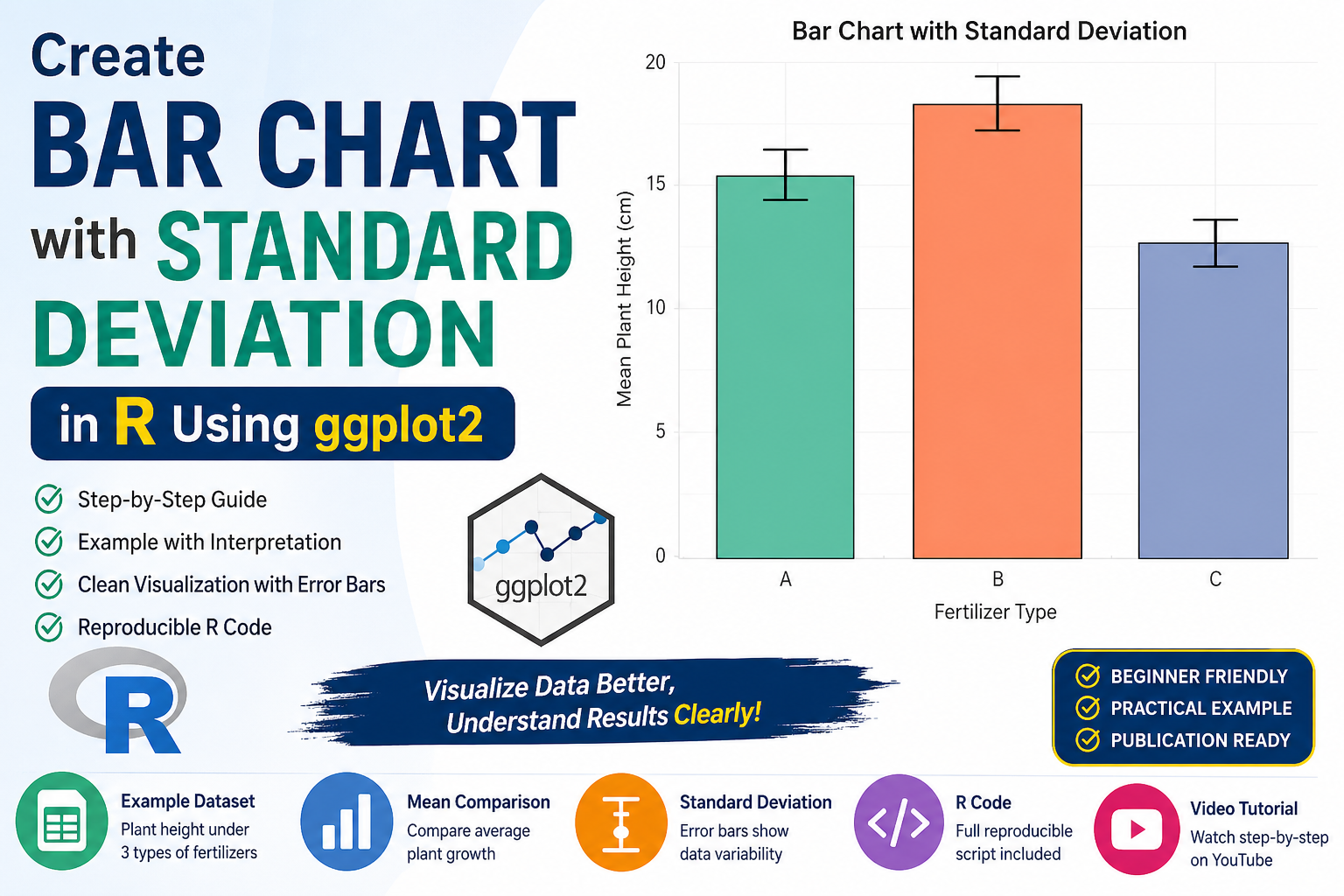
Bar Chart Interpretation
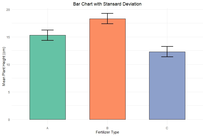
Fertilizer A
- Mean height ≈ 15.3 cm
- Moderate SD
- Plants show consistent growth
Fertilizer B
- Highest mean ≈ 18.3 cm
- Slight variability
- Best fertilizer for growth
Fertilizer C
- Lowest mean ≈ 12.4 cm
- Smaller SD
- Consistent but poor growth
Key Insights:
- Fertilizer B performs best overall
- Fertilizer C shows lowest growth
- Error bars indicate reliability of results
Complete Example Table
| Fertilizer | Mean Height (cm) | SD |
|---|---|---|
| A | ~15.3 | ~1 |
| B | ~18.3 | ~1 |
| C | ~12.4 | ~1 |
Best Practices
- Always include error bars for scientific data
- Use clear labels and titles
- Avoid misleading visuals without variability
- Choose appropriate color palettes
👉 Download Section
YouTube Video
Conclusion
Creating a bar chart with standard deviation in R using ggplot2 is essential for meaningful data visualization. It not only shows average values but also highlights variability, making your analysis more reliable and scientifically valid.
Using your example, we observed that Fertilizer B leads to the highest plant growth, while Fertilizer C performs the worst. The inclusion of standard deviation allows us to confidently interpret these results.
Mastering this technique is highly valuable for students, researchers, and data analysts working in R.