
Introduction
Data visualization is one of the most important parts of statistical analysis and biostatistics. In research studies, scientists and analysts often need to compare group means clearly and effectively. A bar chart is one of the easiest graphical methods used to display comparisons between categories. However, showing only the mean values is not always enough because researchers also need to understand the variability or uncertainty in the data.
This is where Standard Error (SE) becomes useful. A bar chart with standard error bars helps readers understand how accurate the mean values are for each group. In R Studio2, creating a bar chart with standard error is simple using the ggplot2 package.
In this tutorial, you will learn:
- What is a bar chart
- What is standard error
- Difference between standard deviation and standard error
- How to calculate SE in R
- How to create a bar chart with SE in R Studio2
- Step-by-step explanation of R code
- Interpretation of the graph
- Best practices for visualization
What is a Bar Chart?
A bar chart is a graphical representation used to compare categorical data using rectangular bars. The height of each bar represents the value of a variable.
In biostatistics and data science, bar charts are commonly used to compare:
- Mean values
- Treatment effects
- Experimental groups
- Fertilizer performance
- Drug responses
For example, in this tutorial, plant height is compared among three fertilizer groups:
- Control
- Fert_A
- Fert_B
What is Standard Error (SE)?
Standard Error measures how accurately the sample mean represents the population mean.
The formula for Standard Error is:
Where:
- SE = Standard Error
- SD = Standard Deviation
- n = Sample size
A smaller SE indicates that the sample mean is more reliable.
Difference Between Standard Deviation and Standard Error
| Feature | Standard Deviation (SD) | Standard Error (SE) |
|---|---|---|
| Purpose | Measures spread of data | Measures accuracy of mean |
| Indicates | Variability among observations | Precision of sample mean |
| Formula | Based on deviations from mean | SD divided by square root of sample size |
| Usage | Descriptive statistics | Inferential statistics |
Why Use Standard Error in Bar Charts?
Adding SE bars to a bar chart helps to:
- Show uncertainty in mean values
- Compare variability among groups
- Improve scientific interpretation
- Make research graphs more professional
- Support publication-quality visualization
Researchers commonly use SE bars in:
- Clinical research
- Agriculture studies
- Pharmaceutical analysis
- Biological experiments
- Public health studies
Dataset Used in This Example
In this example, we use a plant growth dataset containing:
| Fertilizer | Height_cm |
|---|---|
| Control | 45 |
| Fert_A | 56 |
| Fert_B | 63 |
The dataset compares plant heights under different fertilizer treatments.
Step-by-Step Guide to Create Bar Chart with Standard Error in R Studio2
Step 1: Prepare the Excel File
Create an Excel file named:
plant_data.xlsx
Use:
- Sheet Name: Sheet1
The dataset should contain:
| Fertilizer | Height_cm |
|---|---|
| Control | 46 |
| Control | 48 |
| Fert_A | 57 |
| Fert_A | 59 |
| Fert_B | 63 |
| Fert_B | 65 |
Step 2: Install Required Packages
Install the required packages in R Studio.
install.packages("readxl")
install.packages("ggplot2")
install.packages("dplyr")
Explanation
- readxl → Imports Excel files
- ggplot2 → Creates graphs
- dplyr → Performs data manipulation
Run these commands only once.
Step 3: Import Excel File in R
Method 1: Using File Path
library(readxl)

data <- read_excel("C:/Users/YourName/Documents/plant_data.xlsx")

print(data)
Method 2: Select File Manually
library(readxl)

data <- read_excel(file.choose())

print(data)
Explanation
read_excel()imports Excel datafile.choose()opens a file browserprint(data)displays the dataset
This step imports the dataset into R Studio.
Step 4: Load Required Libraries
library(ggplot2)
library(dplyr)
Explanation
ggplot2is used for plottingdplyrhelps summarize data efficiently
Step 5: Calculate Mean and Standard Error
summary_data <- data %>%
  group_by(Fertilizer) %>%
  summarise(
    mean_height = mean(Height_cm),
    sd = sd(Height_cm),
    n = n(),
    se = sd / sqrt(n)
  )

print(summary_data)
Explanation of the Code
group_by(Fertilizer)
Groups the data based on fertilizer type.
mean(Height_cm)
Calculates average plant height.
sd(Height_cm)
Calculates standard deviation.
n()
Counts observations in each group.
se = sd / sqrt(n)
Calculates standard error.
The SE calculation is:
Step 6: Create Bar Chart with Standard Error
plot <- ggplot(summary_data, aes(x = Fertilizer, y = mean_height, fill = Fertilizer)) +
  geom_bar(
    stat = "identity",
    width = 0.6,
    color = "black"
  ) +
  geom_errorbar(
    aes(ymin = mean_height - se, ymax = mean_height + se),
    width = 0.2,
    size = 1
  ) +
  labs(
    title = "Bar Chart with Standard Error",
    x = "Fertilizer Type",
    y = "Mean Height (cm)"
  ) +
  theme_minimal() +
  theme(
    text = element_text(size = 14),
    legend.position = "none"
  )

print(plot)
The complete script used for this graph is available in the attached R script file.
Explanation of ggplot2 Functions
ggplot()
Initializes the plotting system.
aes()
Maps variables to axes and colors.
geom_bar()
Creates the bar chart.
stat = "identity"
Uses actual values instead of counting frequencies.
geom_errorbar()
Adds standard error bars.
ymin = mean_height - se
ymax = mean_height + se
Creates upper and lower error limits.
labs()
Adds chart title and axis labels.
theme_minimal()
Applies a clean theme.
theme()
Customizes text size and removes legend.
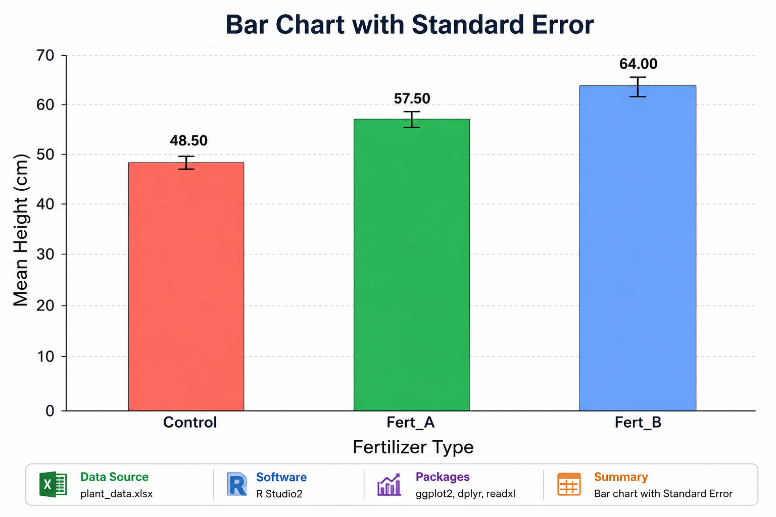
Interpretation of the Bar Chart

The bar chart displays the mean plant height for three fertilizer groups:
- Control
- Fert_A
- Fert_B
Observations
- Fert_B shows the highest mean plant height.
- Control has the lowest mean height.
- Standard error bars are relatively small.
- Small SE bars indicate consistent observations within groups.
- The graph suggests fertilizer treatment improves plant growth.
Scientific Interpretation
- Fert_B appears more effective than Control and Fert_A.
- Low SE values indicate reliable mean estimates.
- The visualization helps compare treatment performance clearly.
Advantages of Using ggplot2
Using ggplot2 in R Studio provides:
- Professional-quality graphics
- High customization
- Better visualization control
- Publication-ready charts
- Easy addition of error bars
Common Errors and Solutions
Error: Package Not Found
Solution
Install missing packages:
install.packages("ggplot2")
Error: File Not Found
Solution
Check file path or use:
file.choose()
Error: Object Not Found
Solution
Verify column names:
names(data)
Best Practices for Bar Charts with SE
- Use meaningful axis labels
- Add proper chart titles
- Keep colors simple
- Avoid overcrowding
- Use consistent formatting
- Interpret error bars carefully
📥 Download R Script
Download Full R Script Here
🎥 Watch Full Video Tutorial
Conclusion
A bar chart with standard error is an essential statistical visualization method in biostatistics and data analysis. It helps researchers compare mean values while also showing the reliability of those means. Using ggplot2 in R Studio2 makes the process simple, flexible, and professional.
In this tutorial, you learned how to:
- Import Excel data
- Calculate mean and standard error
- Create a bar chart using ggplot2
- Add error bars
- Interpret the results
This method is highly useful for scientific research, academic projects, agriculture studies, and biomedical data analysis. By mastering bar charts with standard error in R Studio2, you can create publication-quality visualizations for your statistical work.