
Introduction
Data visualization is a crucial component of biostatistics, helping researchers and students interpret complex datasets easily. Among the various graphical tools available, the bar chart is one of the simplest and most effective methods for representing categorical data.
In this tutorial, you will learn how to create a basic bar chart in R Studio using a real-world biostatistics dataset. This guide is designed especially for beginners and includes step-by-step instructions, R code, and interpretation.
What is a Bar Chart?
A bar chart is a graphical representation of categorical data where each category is represented by a rectangular bar. The height (or length) of each bar corresponds to the value it represents.
Key Features:
- Represents categorical variables
- Easy comparison between groups
- Widely used in biostatistics and medical research
Concept Behind Bar Chart in Biostatistics
In biostatistics, bar charts are used to:
- Compare disease prevalence
- Analyze patient distribution
- Evaluate treatment outcomes
For example, comparing the number of patients suffering from different diseases helps healthcare professionals make informed decisions.
Watch Video Tutorial
Dataset Used in This Example
We use a simple dataset showing the number of patients affected by different diseases:
| Disease | Patients |
|---|---|
| Diabetes | 50 |
| Hypertension | 65 |
| Asthma | 30 |
| Cancer | 20 |
| Heart Disease | 40 |
📥 Download Dataset
Step-by-Step Explanation Using R Studio
Step 1: Create Data
disease <- c("Diabetes", "Hypertension", "Asthma", "Cancer", "Heart Disease")
patients <- c(50, 65, 30, 20, 40)

data <- data.frame(Disease = disease, Patients = patients)
print(data)
Step 2: Basic Bar Chart
barplot(data$Patients)
This creates a simple bar chart without labels.
Step 3: Add Labels and Colors
barplot(
  data$Patients,
  names.arg = data$Disease,
  col = "skyblue",
  main = "Number of Patients by Disease",
  xlab = "Disease Type",
  ylab = "Number of Patients",
  border = "black"
)
Now the chart is more informative and visually clear.
Step 4: Add Data Labels on Bars
bp <- barplot(
  data$Patients,
  names.arg = data$Disease,
  col = "lightgreen",
  main = "Number of Patients by Disease",
  xlab = "Disease Type",
  ylab = "Number of Patients"
)

text(
  x = bp,
  y = data$Patients,
  labels = data$Patients,
  pos = 3,
  cex = 0.8
)
Displays values on top of each bar.
Step 5: Fix Label Cut-Off Issue
bp <- barplot(
  data$Patients,
  names.arg = data$Disease,
  col = "lightgreen",
  main = "Number of Patients by Disease",
  xlab = "Disease Type",
  ylab = "Number of Patients",
  ylim = c(0, 75)
)

text(
  x = bp,
  y = data$Patients,
  labels = data$Patients,
  pos = 3,
  cex = 0.8
)
This ensures labels are fully visible.
Full R Script Download
You can provide your script like this in your blog:
Bar Chart Output
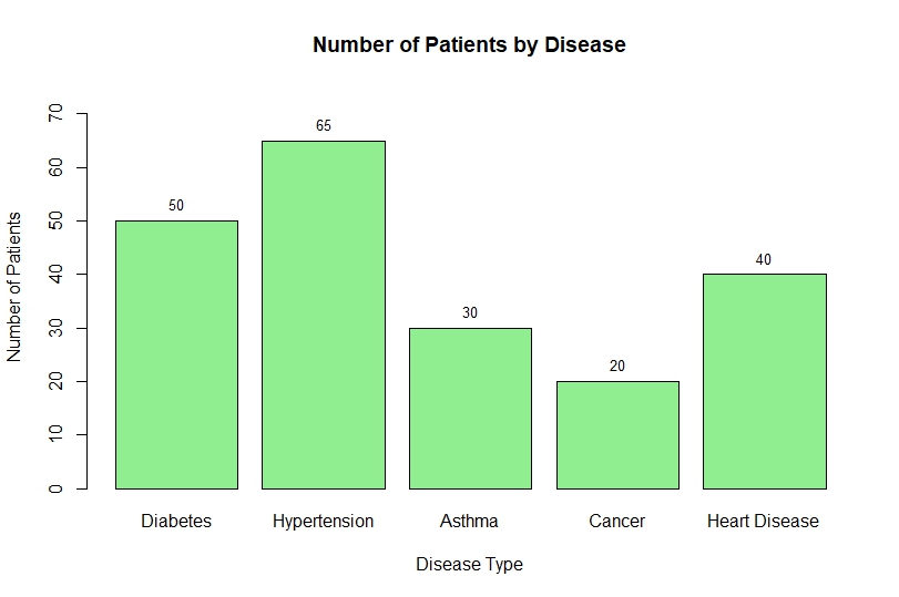
Interpretation of the Bar Chart
From the above bar chart:
- Hypertension (65 patients) has the highest prevalence
- Cancer (20 patients) has the lowest number of cases
- Diabetes and Heart Disease show moderate levels
- Asthma has comparatively fewer patients
Insights:
- Hypertension is a major health concern
- Resource allocation should focus more on high-prevalence diseases
- Useful for public health planning
Advantages of Using Bar Charts
- Easy to understand
- Suitable for categorical data
- Helps in quick comparison
- Widely used in research
Common Mistakes to Avoid
- Not labeling axes
- Overlapping text labels
- Improper scaling
- Using wrong chart type
Conclusion
Creating a basic bar chart in R Studio is an essential skill for anyone working in biostatistics and data analysis. With just a few lines of code, you can transform raw data into meaningful visual insights.
In this tutorial, we covered:
- Dataset creation
- Barplot function
- Customization
- Labeling and fixing errors
- Interpretation
Bar charts are powerful tools that help simplify complex healthcare data and support better decision-making.