
Introduction
Data visualization is a critical component of data analysis, especially in fields like biostatistics and biomedical research. Among the many visualization tools available in R, the barplot is one of the simplest and most widely used methods for representing categorical data.
In real-world scenarios, using a single color for all bars may not effectively communicate differences between categories. This is where customizing bar colors becomes essential. Assigning different colors to each bar enhances readability, improves visual appeal, and makes your graph more informative.
In this tutorial, you will learn how to change bar colors individually in an R barplot using a simple dataset. This guide is beginner-friendly and builds upon basic barplot concepts.
Definition of Barplot in R
A barplot in R is a graphical representation used to display categorical data with rectangular bars, where the length or height of each bar corresponds to the value it represents.
Concept Explanation
By default, R assigns a single color to all bars in a barplot. However, the col argument allows you to customize colors.
Key Concept:
col = "blue"→ All bars same colorcol = c("red", "blue", "green", ...)→ Each bar different color
This means you can pass a vector of colors to assign unique colors to each category.
Dataset Explanation
In this example, we use a simple biomedical dataset:
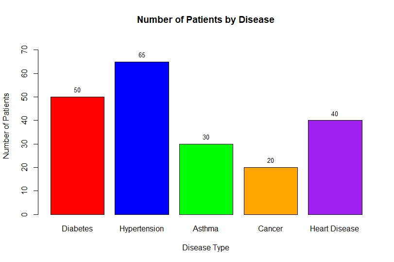
- Diseases: Diabetes, Hypertension, Asthma, Cancer, Heart Disease
- Patients count: 50, 65, 30, 20, 40
This dataset helps visualize how many patients are affected by each disease.
Step-by-Step Implementation in R
Step 1: Create Vectors
We define disease names and corresponding patient counts:
disease <- c("Diabetes", "Hypertension", "Asthma", "Cancer", "Heart Disease")
patients <- c(50, 65, 30, 20, 40)
Step 2: Create Data Frame
Combine vectors into a structured dataset:
data <- data.frame(Disease = disease, Patients = patients)
print(data)
Step 3: Basic Barplot
A simple barplot without customization:
barplot(data$Patients)
This produces a basic graph but lacks labels and clarity.
Step 4: Add Labels and Title
barplot(
  data$Patients,
  names.arg = data$Disease,
  col = "skyblue",
  main = "Number of Patients by Disease",
  xlab = "Disease Type",
  ylab = "Number of Patients"
)
Step 5: Apply Different Colors to Each Bar
This is the key step:
col = c("red", "blue", "green", "orange", "purple")
Now apply it:
barplot(
  data$Patients,
  names.arg = data$Disease,
  col = c("red", "blue", "green", "orange", "purple"),
  main = "Number of Patients by Disease",
  xlab = "Disease Type",
  ylab = "Number of Patients",
  border = "black"
)
Step 6: Add Data Labels on Bars
bp <- barplot(
  data$Patients,
  names.arg = data$Disease,
  col = c("red", "blue", "green", "orange", "purple"),
  ylim = c(0, 75)
)

text(
  x = bp,
  y = data$Patients,
  label = data$Patients,
  pos = 3
)
Full R Script
Barplot Output Interpretation
From the bar chart:
- Hypertension (65 patients) has the highest count
- Diabetes (50 patients) is the second most common
- Heart Disease (40 patients) shows moderate cases
- Asthma (30 patients) is lower
- Cancer (20 patients) has the least number of patients
Key Insight:
The use of different colors makes it easier to:
- Distinguish categories instantly
- Highlight differences visually
- Improve presentation quality
Why Use Different Colors?
Using multiple colors in barplots provides:
- ✅ Better visual clarity
- ✅ Improved audience engagement
- ✅ Easier comparison of categories
- ✅ Professional presentation style
Conclusion
Changing bar colors individually in an R barplot is a simple yet powerful technique that enhances data visualization. By using the col argument with a vector of colors, you can make your charts more informative, visually appealing, and easier to interpret.
This method is especially useful in biostatistics, research presentations, and academic projects, where clear communication of data is essential.
By mastering this technique, you can significantly improve the quality of your graphical outputs in R.