
Introduction to Horizontal Bar Chart
A Horizontal Bar Chart is a graphical representation used to compare categorical data using rectangular horizontal bars. The length of each bar represents the value associated with a specific category.
Unlike vertical bar charts, horizontal bar charts display categories on the y-axis and values on the x-axis. This format is especially useful when category names are long or when the chart contains multiple categories.
Horizontal bar charts are widely used in:
- Biology
- Ecology
- Environmental science
- Medical research
- Population studies
- Agricultural statistics
- Biostatistics
In this tutorial, we use a biological dataset representing the number of bird species observed in different ecosystems such as wetlands, forests, grasslands, and mangroves.
Watch Full Video Tutorial
Biological Dataset Used
The dataset contains two variables:
| Region | Species_Count |
|---|---|
| Wetland | 10 |
| Forest | 8 |
| Grassland | 7 |
| Mangrove | 6 |
| Desert | 5 |
| Mountain | 4 |
| Coastal | 3 |
| Riverbank | 2 |
Variable Description
- Region → Ecosystem category
- Species_Count → Number of bird species observed
This type of dataset is commonly used in biodiversity and ecological studies.
Concept of Horizontal Bar Chart
The primary purpose of a Horizontal Bar Chart is to visually compare values between categories.
In our example:
- Each ecosystem region is represented as a category.
- The horizontal bar length indicates the number of bird species observed.
- Longer bars indicate higher biodiversity.
This visualization makes it easy to identify:
- Regions with maximum species diversity
- Regions with minimum diversity
- Overall distribution patterns
Why Use Horizontal Bar Charts?
Horizontal Bar Charts are preferred when:
- Category names are lengthy
- There are many categories
- Easy readability is required
- Comparative visualization is needed
Compared with vertical charts, horizontal charts improve label visibility and provide a cleaner scientific presentation.
R Packages Required
The script uses the ggplot2 package.
Package Used
| Package | Purpose |
|---|---|
| ggplot2 | Data visualization |
Install the package using:
install.packages("ggplot2")
Load the package:
library(ggplot2)
Step-by-Step Explanation of R Script
Step 1: Create the Biological Dataset
The first step is creating the dataset using the data.frame() function.
bio_data <- data.frame(

  Region = c("Wetland",
             "Forest",
             "Grassland",
             "Mangrove",
             "Desert",
             "Mountain",
             "Coastal",
             "Riverbank"),

  Species_Count = c(10, 8, 7, 6, 5, 4, 3, 2)
)
Explanation
Regioncontains ecosystem names.Species_Countcontains observed bird species numbers.data.frame()combines the variables into a structured dataset.
Step 2: Display Dataset
print(bio_data)
This command displays the dataset in the R console.
Step 3: Create the Horizontal Bar Chart
bio_chart <- ggplot(bio_data,
                    aes(x = Species_Count,
                        y = reorder(Region, Species_Count)))
Explanation
ggplot()initializes the graph.aes()defines aesthetic mappings.x = Species_Countplaces numerical values on the x-axis.y = Regionplaces categories on the y-axis.reorder()arranges categories based on species count.
Step 4: Add Horizontal Bars
geom_bar(stat = "identity",
         fill = "darkgreen",
         alpha = 0.7,
         width = 0.5)
Explanation
geom_bar()
Creates the bar chart.
stat = "identity"
Uses actual values from the dataset.
fill = "darkgreen"
Changes bar color to dark green.
alpha = 0.7
Controls transparency level.
width = 0.5
Adjusts bar thickness.
Step 5: Add Chart Title
ggtitle("Bird Species Distribution Across Ecosystems")
Step 6: Add Axis Labels
xlab("Number of Species") +
ylab("Ecosystem Region")
Step 7: Apply Theme
theme_minimal()
Applies a clean minimal theme suitable for research visualization.
Step 8: Customize Text
theme(
  plot.title = element_text(size = 16,
                            face = "bold",
                            hjust = 0.5),

  axis.title = element_text(size = 14,
                            face = "bold"),

  axis.text = element_text(size = 12,
                           color = "black")
)
Purpose
- Increases font size
- Makes text bold
- Centers chart title
- Improves readability
Step 9: Display Graph
print(bio_chart)
Displays the final chart in R Studio.
Step 10: Save Graph
ggsave("Green_BarChart_Biological_Data.png",
       plot = bio_chart,
       width = 8,
       height = 6,
       dpi = 300)
Explanation
- Saves graph as PNG image
dpi = 300creates publication-quality resolution
Full R Script File
Download R Studio Script File
Interpretation of the Horizontal Bar Chart
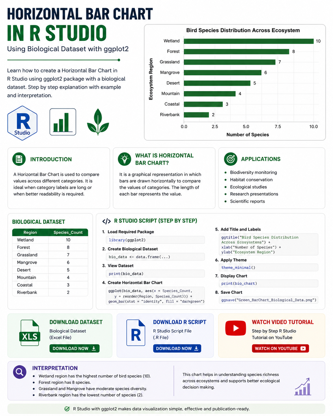
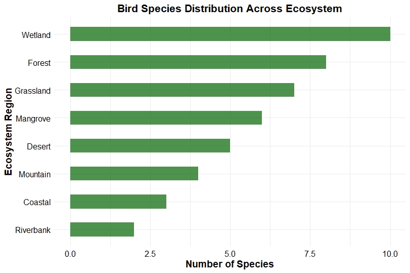
The generated chart shows bird species distribution across different ecosystems.
Key Findings
Wetland Region
The Wetland ecosystem contains the highest species count (10), indicating rich biodiversity and favorable environmental conditions.
Forest Region
Forest ecosystems show the second-highest species diversity with 8 species.
Grassland and Mangrove
Moderate biodiversity is observed in grassland and mangrove regions.
Riverbank Region
Riverbank ecosystem has the lowest species count, suggesting lower habitat diversity or environmental limitations.
Scientific Importance of Interpretation
This type of analysis is useful for:
- Biodiversity monitoring
- Habitat conservation
- Wildlife management
- Environmental impact assessment
- Ecological comparison studies
Researchers can use such graphs to identify critical conservation regions.
Advantages of Horizontal Bar Charts
Easy Comparison
Allows quick comparison between categories.
Better Label Visibility
Long category names remain readable.
Publication Friendly
Suitable for scientific articles and presentations.
Simple Interpretation
Easy for beginners and researchers.
Applications in Biological Research
Horizontal Bar Charts are widely used in:
- Ecology
- Zoology
- Botany
- Environmental science
- Population biology
- Fisheries research
- Wildlife conservation
- Agricultural studies
Conclusion
Horizontal Bar Charts are powerful tools for visualizing categorical biological data in R Studio. They provide clear comparisons between ecosystem regions and help researchers interpret biodiversity distribution effectively.
Using the ggplot2 package, we can easily create professional-quality scientific visualizations suitable for research papers, presentations, and educational content.
In this tutorial, we learned:
- the concept of Horizontal Bar Charts
- creation of biological datasets
- step-by-step R script explanation
- chart customization
- scientific interpretation
- applications in biology and ecology
R Studio and ggplot2 together provide a flexible and efficient environment for statistical graphics and biological data visualization.