
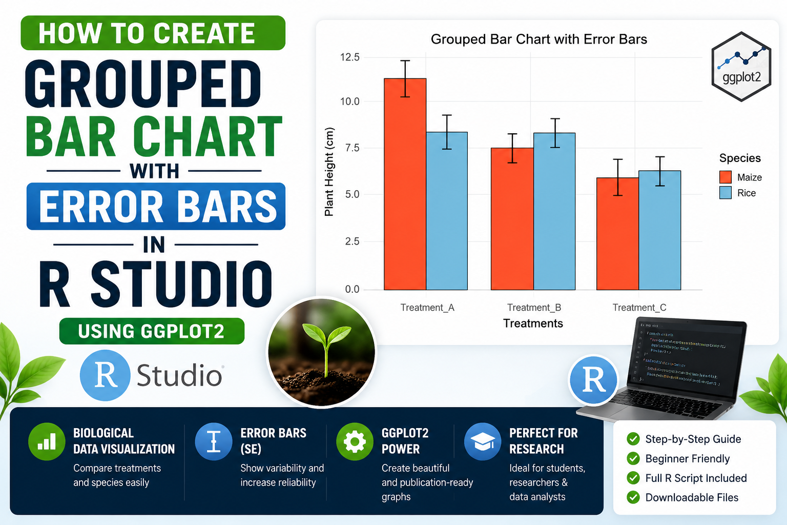
Introduction
Data visualization is an important part of biological research and biostatistics. Scientists and researchers often use graphs to compare experimental results and clearly present their findings. Among the many visualization techniques available in R Studio, the grouped bar chart with error bars is one of the most useful methods for displaying biological data.
A grouped bar chart helps compare multiple categories across different experimental conditions, while error bars represent the variability or uncertainty in the data. In biological studies, error bars commonly represent Standard Error (SE) or Standard Deviation (SD).
In this tutorial, you will learn how to create a grouped bar chart with error bars in R Studio using the powerful ggplot2 package. We will use a simple biological dataset containing plant height measurements under different treatments. This guide is beginner-friendly and explains every step in detail.
Watch Video Tutorial
Grouped Bar Chart with Error Bars in R Studio
What is a Grouped Bar Chart?
A grouped bar chart is a graphical representation used to compare values between multiple groups. Instead of displaying a single bar for each category, grouped bar charts display multiple bars side by side.
For example:
- Comparing plant species under different treatments
- Comparing gene expression levels across conditions
- Comparing crop yields between fertilizer types
Grouped bar charts make it easier to identify differences between groups visually.
What are Error Bars?
Error bars are graphical lines added to charts to represent variability in the data.
In biological and statistical analysis, error bars usually indicate:
- Standard Error (SE)
- Standard Deviation (SD)
- Confidence Interval (CI)
Error bars help researchers understand:
- Data consistency
- Experimental variability
- Reliability of measurements
In this example, we use Standard Error (SE).
Why Use ggplot2 in R Studio?
The ggplot2 package is one of the most popular data visualization libraries in R.
Advantages of ggplot2:
- Professional scientific graphs
- Easy customization
- Publication-quality figures
- Attractive themes and colors
- Widely used in biology and biostatistics research
Biological Dataset Used
In this tutorial, we use a biological dataset containing plant height measurements of two species:
- Rice
- Maize
The plants are grown under three different treatments:
- Treatment_A
- Treatment_B
- Treatment_C
The dataset also contains Standard Error (SE) values for each observation.
Step 1: Install and Load ggplot2
Before creating graphs, install the ggplot2 package in R Studio.
install.packages("ggplot2")
Load the package:
library(ggplot2)
The ggplot2 package provides advanced plotting functions for scientific visualization.
Step 2: Create the Biological Dataset
Now create the dataset using the data.frame() function.
data <- data.frame(

  Treatment = c("Treatment_A",
                "Treatment_A",
                "Treatment_B",
                "Treatment_B",
                "Treatment_C",
                "Treatment_C"),

  Species = c("Rice",
              "Maize",
              "Rice",
              "Maize",
              "Rice",
              "Maize"),

  Height = c(8.4, 11.4,
             8.5, 7.6,
             6.5, 6.2),

  SE = c(0.9, 0.9,
         0.6, 0.7,
         0.6, 0.9)
)
Explanation of Variables
| Variable | Description |
|---|---|
| Treatment | Experimental conditions |
| Species | Plant species |
| Height | Plant height measurements |
| SE | Standard Error values |
This dataset is commonly used in biological and agricultural experiments.
Step 3: Create the Grouped Bar Chart
The ggplot() function initializes the graph.
ggplot(data,
       aes(x = Treatment,
           y = Height,
           fill = Species))
Explanation
x = Treatment→ Treatments shown on X-axisy = Height→ Plant height valuesfill = Species→ Different colors for species
This creates the foundation of the grouped bar chart.
Step 4: Add Bars to the Graph
Now add bars using geom_bar().
geom_bar(stat = "identity",
         position = position_dodge(),
         color = "black")
Explanation
| Function | Purpose |
|---|---|
| stat = “identity” | Uses actual dataset values |
| position_dodge() | Places bars side by side |
| color = “black” | Adds black border around bars |
This creates grouped bars for each treatment.
Step 5: Add Error Bars
Error bars are added using geom_errorbar().
geom_errorbar(aes(ymin = Height - SE,
                  ymax = Height + SE),

              width = 0.2,

              position = position_dodge(0.9))
Explanation
| Argument | Purpose |
|---|---|
| ymin | Lower error bar limit |
| ymax | Upper error bar limit |
| width | Width of error bars |
| position_dodge() | Aligns error bars correctly |
Error bars improve the scientific quality of the graph.
Step 6: Add Colors to the Bars
Custom colors make graphs visually attractive.
scale_fill_manual(values = c("tomato",
                             "skyblue"))
Color Used
| Species | Color |
|---|---|
| Rice | Tomato |
| Maize | Skyblue |
These colors improve readability and presentation quality.
Step 7: Add Labels and Title
labs(title = "Grouped Bar Chart with Error Bars",

     x = "Treatments",

     y = "Plant Height (cm)")
Purpose
- Adds graph title
- Labels X-axis
- Labels Y-axis
Good labels make graphs easier to understand.
Step 8: Apply Theme
theme_minimal(base_size = 14)
Why Use Themes?
Themes improve the appearance of graphs:
- Cleaner layout
- Professional design
- Better readability
The theme_minimal() function creates a simple scientific-style graph.
Full R Script
The complete R script used in this tutorial is available below.
# =====================================
# GROUPED BAR PLOT WITH ERROR BARS
# USING ggplot2
# =====================================

# Load package
library(ggplot2)

# =====================================
# BIOLOGICAL DATASET
# =====================================

data <- data.frame(

  Treatment = c("Treatment_A",
                "Treatment_A",
                "Treatment_B",
                "Treatment_B",
                "Treatment_C",
                "Treatment_C"),

  Species = c("Rice",
              "Maize",
              "Rice",
              "Maize",
              "Rice",
              "Maize"),

  Height = c(8.4, 11.4,
             8.5, 7.6,
             6.5, 6.2),

  SE = c(0.9, 0.9,
         0.6, 0.7,
         0.6, 0.9)
)

# =====================================
# DRAW GRAPH
# =====================================

ggplot(data,
       aes(x = Treatment,
           y = Height,
           fill = Species)) +

  geom_bar(stat = "identity",
           position = position_dodge(),
           color = "black") +

  geom_errorbar(aes(ymin = Height - SE,
                    ymax = Height + SE),

                width = 0.2,

                position = position_dodge(0.9)) +

  scale_fill_manual(values = c("tomato",
                               "skyblue")) +

  labs(title = "Grouped Bar Chart with Error Bars",

       x = "Treatments",

       y = "Plant Height (cm)") +

  theme_minimal(base_size = 14)
Download Full R Studio Script
Grouped Bar Chart with Error Bars Interpretation
The grouped bar chart shows differences in plant height between Rice and Maize under three treatments.
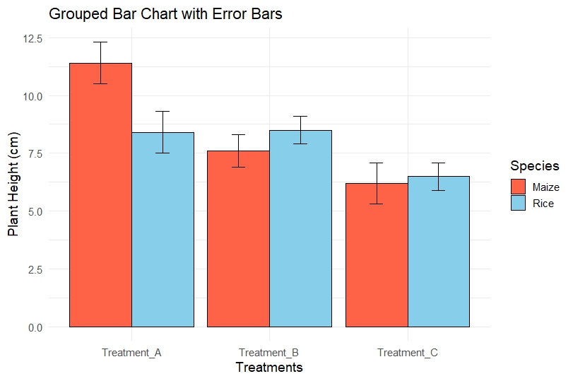
Observations
Treatment_A
- Maize shows higher plant height than Rice.
- Error bars are moderate, indicating some variability.
Treatment_B
- Rice has slightly higher height than Maize.
- Error bars are smaller compared to Treatment_A.
Treatment_C
- Both species show lower plant height.
- This treatment may negatively affect growth.
Biological Interpretation
From the graph, we can conclude:
- Treatment_A supports better growth for Maize.
- Treatment_B shows balanced growth.
- Treatment_C results in reduced plant height.
Error bars indicate the reliability of the measurements. Smaller error bars suggest more consistent experimental results.
Advantages of Grouped Bar Charts in Biology
Grouped bar charts are widely used in:
- Plant biology
- Agricultural research
- Ecology
- Genetics
- Biostatistics
- Medical research
They help researchers compare:
- Experimental groups
- Treatments
- Species
- Biological responses
Conclusion
Grouped bar charts with error bars are essential tools for biological data visualization in R Studio. Using the ggplot2 package makes it easy to create professional and publication-quality scientific graphs.
In this tutorial, we learned:
- How to create a biological dataset
- How to build grouped bar charts
- How to add error bars
- How to customize colors and themes
- How to interpret biological results
This type of visualization is highly useful in biostatistics, agricultural research, ecology, and biological sciences. By mastering grouped bar charts in R Studio, researchers and students can present experimental data more effectively and professionally.